The Process (Not the Church) of Lilith
Lilith
Lilith. A subject I’ve wanted to tackle for awhile now and was finally able to. But not without significant struggles along the way. Lilith by religious stands, (depending on what doctrine you may follow) is regarded as a Demon first, if at all, and Adams first wife second. Her story is of no compromise and desire for equality, something she was damned for. In more modern times, she’s revered as a feminist icon. Rightfully so in my opinion.
The process of this particular piece is one I’m proud of, and while I was explaining how I go about my work to someone, they couldn’t visualize all the steps I go through, and what all I did to produce a final piece. A perfect reason to write up a little blog about it.
Step 1: The Idea

Everything starts with an idea. More times than not, a sketch, a doodle a rough layout, notes and ideas. I’ve been trying to do better these last couple years in mapping out my concepts in my sketchbook. These two pages are those loose concepts I thought I wanted to go with.
Step 2: Reference

I always store STACKS of images that I want to draw from. A lot of portraits, flowers, animals and many other things I like, I just keep and pull from when the time is right. I’ve sat on this picture for a long time. I have no doubt it’s a popular reference for many people with the strong visual it captures. It was easy for me to want to use this pose and face for Lilith.
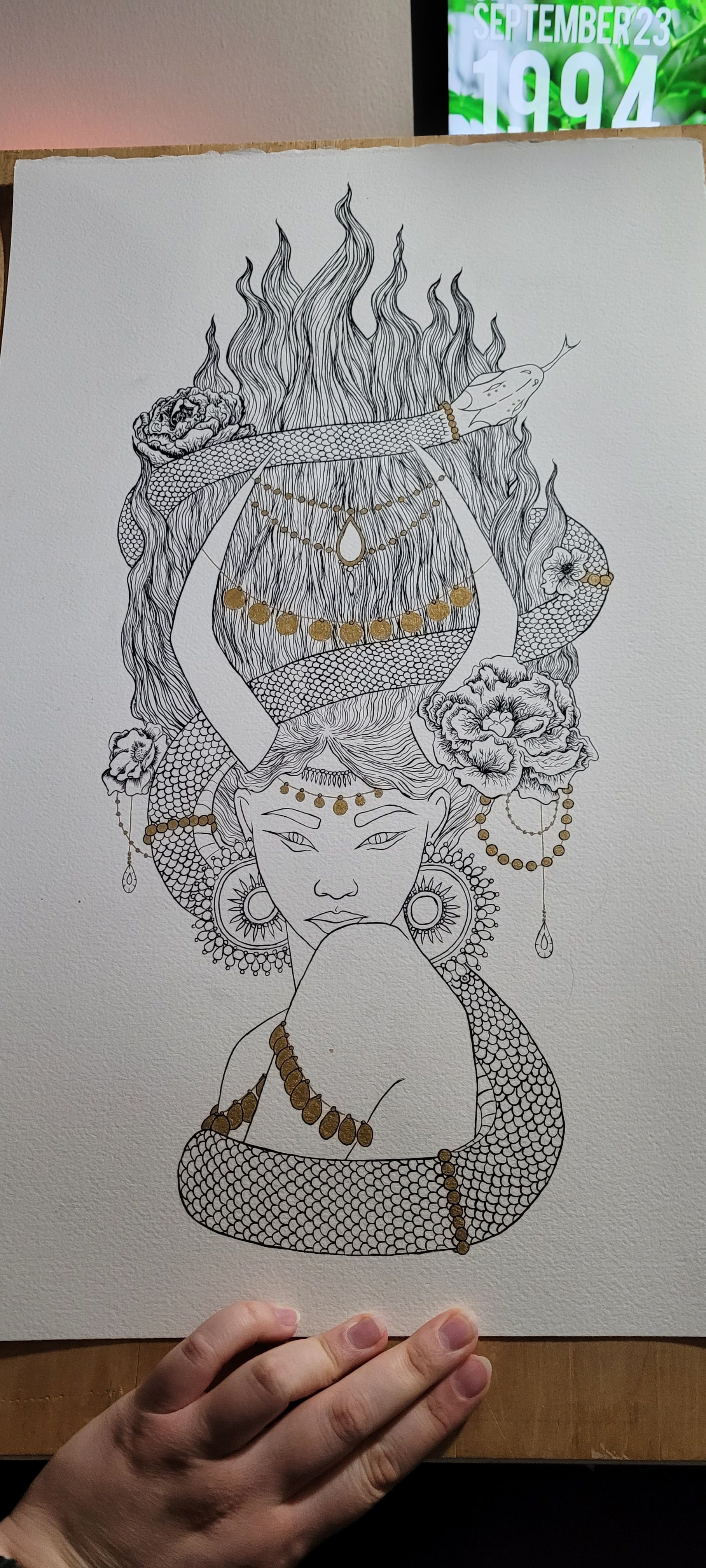
Step 3: Line Work

Line work. Brush and ink on paper in my case. This takes place after the mountains of tracing paper with sketches and revisions. The final image is drawn in red pencil on tracing paper, I then use charcoal based transfer paper and draw over the red lines with a standard drafting mechanical pencil. This creates a legible image on my watercolor paper that I then use a brush and acrylic ink over. I do the basic lines before erasing the charcoal transfer lines. Only after that do I go in with more detail with ink, to add texture, implied shading and other marks to add interest to the piece.
Step 4: Color Study
Color studies are a way to help visualize your final piece of work and how you want the colors to interact with your final piece. I often save images of color concepts that I like, similar to that of saving reference photos. If there’s a picture of anything where I think the colors are interesting I’ll save those files and pull from them later on as well. I do all my color studies in photoshop. I find it easier to switch colors if they’re not to my liking while being able to keep the colors I do like. It also saves my paint from overuse and waste.
However. Sometimes that all still doesn’t work.
DO OVER!
Step 3 2.0: Line work again
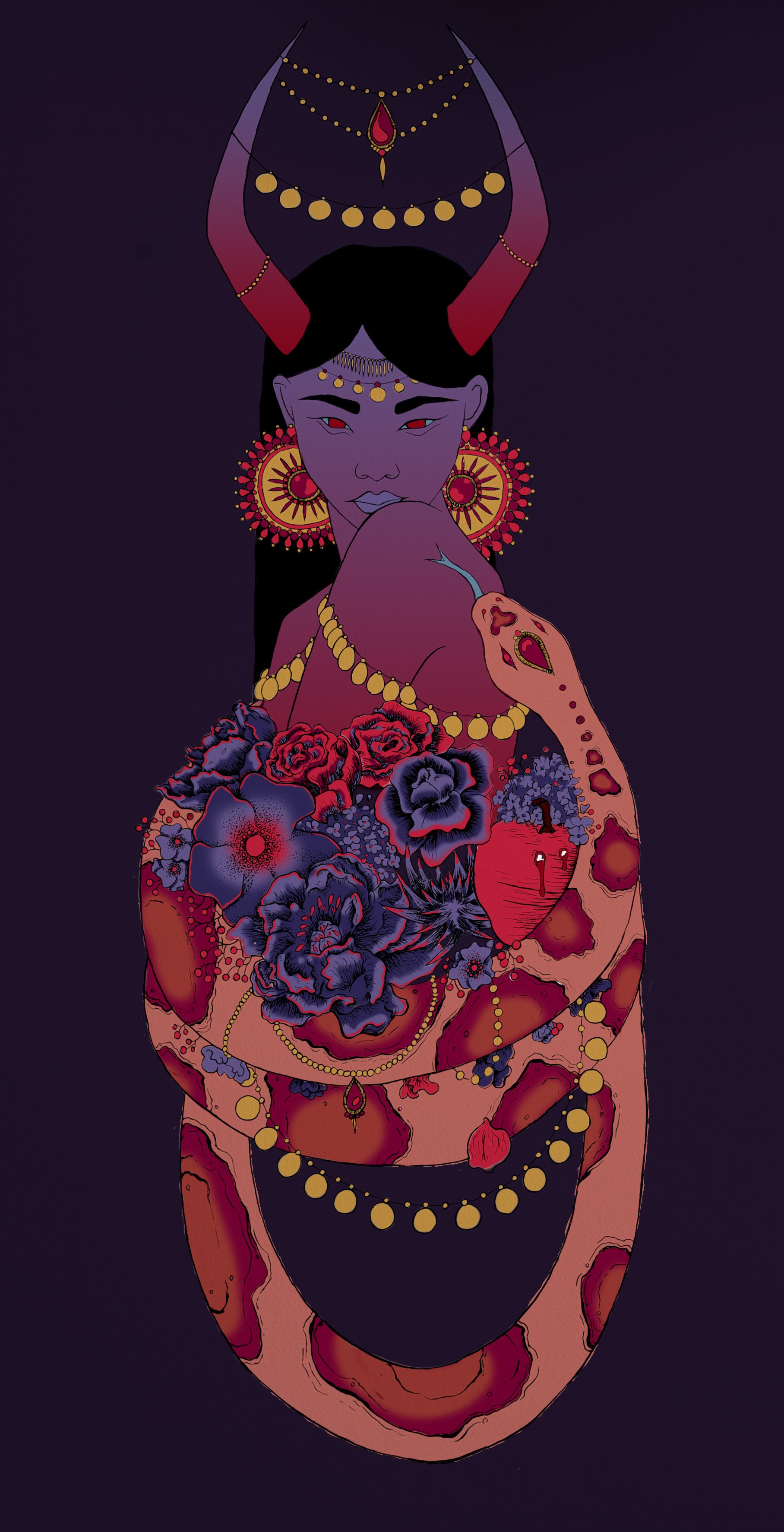
As you may have guessed from the previous images, that was not how my Lilith painting ended up. I no longer have the first painting of Lilith I attempted. But somewhere between my color study and my physical painting, I decided I hated the look. Whether it was my color choices or my composition, it no longer felt like the right piece for me. It wasn’t the Lilith I had wanted to depict.
SO. I did the hard but necessary thing, and started over. The portrait section of the original drawing was all that I saved. And while I do like my first snake idea (I’ve never tried a spotted snake before, and I still want to for something else down the line) He wasn’t as incorporated in the piece as much as I had liked and I was overall not impressed with my bunch of flowers surrounding the figure being held up by the snake.
I redid the drawing with the wanting the focus to be more directly on the portrait of Lilith, with the snake being just as present, but not as big of a focal point. I was much happier with my second line drawing.
Step 4 2.0: Color Study Again

Part of my dislike from the first drawing/painting of Lilith I did, was I felt like the colors I chose ended up being a distraction from the drawing itself. So I totally scraped my original color ideas and went looking for something completely different. When I was happy with my color choices here, I then took swatched of color that you can see on the right of the color study. It’s those swatches that I would use to transfer digital colors into paint color options.
Step 5: Watercolor matching

Converting a digital color study into physical paints is not a simple task. Especially in watercolor. This step requires me to dig into the collection of paints I have and compile ones I think could work. I mix and test various combinations before I decide on ones that will work. I then create a swatch page shown above. Where I write out the color combos and list where those colors will be placed on my drawn out image. These are by no means the only colors and combos I use in a single painting, but they are the key factors that will make the painting work.
Step 6: The Final Painting
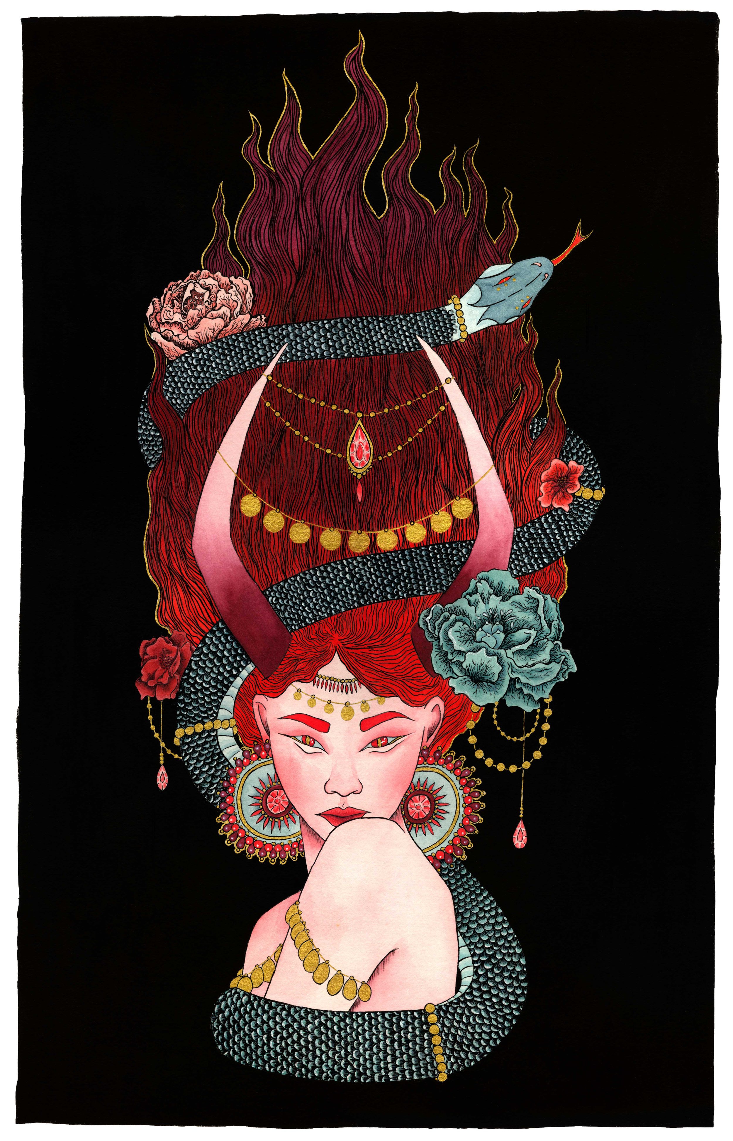
Once your color choices are made, it is a simple matter of getting to work on the painting and finding a place of completion with it. Along with the chosen colors, within the painting I’ve added metallic gold ink on the jewels, hair, eyes and coins as well as some iridescent pearl coating over the snakes scales. Those touches were not completely planned out, but they did make the final painting feel complete to me.
At this point, the painting it scanned and edited to be shown digitally as well as replicated in Giclee prints for sale. The final painting will either be mounted or framed-depending on my new method for finished paintings. That experiment is still to come.